
En un rato libre realice una serie de experimentos con HTML utilizando los bordes y el resultado a sido una fantástica variedad de figuras geométricas.
Los ejemplos son los siguientes:
Cuadrado
<div style="height: 0px; width: 120px; border-left:0px solid transparent; border-right:0px solid transparent; border-top:0px solid transparent; border-bottom:120px solid #0080FF;"></div>
Rectángulo
<div style="height: 0px; width: 220px; border-left:0px solid transparent; border-right:0px solid transparent; border-top:0px solid transparent; border-bottom:120px solid #0080FF;"></div>
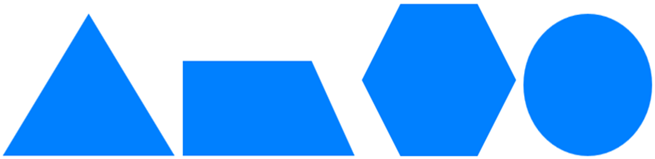
Triangulo equilatero
<div style="height: 0px; width: 0px; border-left:100px solid transparent; border-right:100px solid transparent; border-top:0px solid transparent; border-bottom:150px solid #0080FF;"></div>
Triangulo escaleno
<div style="height: 0px; width: 0px; border-left:0px solid transparent; border-right:200px solid transparent; border-top:0px solid transparent; border-bottom:120px solid #0080FF;"></div>
Triangulo isósceles
<div style="height: 0px; width: 0px; border-left:80px solid transparent; border-right:80px solid transparent; border-top:0px solid transparent; border-bottom:200px solid #0080FF;"></div>
Trapecio isósceles
<div style="height: 0px; width: 100px; border-left:50px solid transparent; border-right:50px solid transparent; border-top:0px solid transparent; border-bottom:100px solid #0080FF;"></div>
Trapecio rectángulo
<div style="height: 0px; width: 150px; border-left:0px solid transparent; border-right:50px solid transparent; border-top:0px solid transparent; border-bottom:100px solid #0080FF;"></div>
Rombo
<div style="height: 0px; width: 0px; border-left:80px solid transparent; border-right:80px solid transparent; border-top:0px solid transparent; border-bottom:120px solid #0080FF;"></div>
<div style="height: 0px; width: 0px; border-left:80px solid transparent; border-right:80px solid transparent; border-top:120px solid #0080FF; border-bottom:0px solid transparent;"></div>
Pentágono
<div style="height: 0px; width: 0px; border-left:100px solid transparent; border-right:100px solid transparent; border-top:0px solid transparent; border-bottom:100px solid #0080FF;"></div>
<div style="height: 0px; width: 100px; border-left:50px solid transparent; border-right:50px solid transparent; border-top:100px solid #0080FF; border-bottom:0px solid transparent;"></div>
Hexágono
<div style="height: 0px; width: 100px; border-left:50px solid transparent; border-right:50px solid transparent; border-top:0px solid transparent; border-bottom:100px solid #0080FF;"></div>
<div style="height: 0px; width: 100px; border-left:50px solid transparent; border-right:50px solid transparent; border-top:100px solid #0080FF; border-bottom:0px solid transparent;"></div>
Circulo
<div style="height: 0px; width: 150px; border-bottom:150px dotted #0080FF;"></div>
Y que te han parecido...espero y te inspiren para hacer las tuyas.


como hago semicirculo
Partelo por la mitad